When Snoopy Met Starbucks: A Collab That Actually Deserves Your Coffee
Let me just say it: I’m usually the first person to approach branded collabs with caution. Most end up being all hype and zero substance—but two days with the Starbucks x Peanuts collection has me completely won over, much like how McLaren’s stunning comeback captured my heart after years of hoping!
The magic of this collection? They didn’t go overboard. In a world where most collaborations scream for attention, these pieces have a quiet confidence. The designers created something that celebrates Schulz’s characters while keeping things grown-up enough that I don’t feel like I’m drinking from a Happy Meal toy during my morning writing sessions or work meetings. It’s a thoughtful design that knows exactly when to make a statement and when to let quality speak for itself.
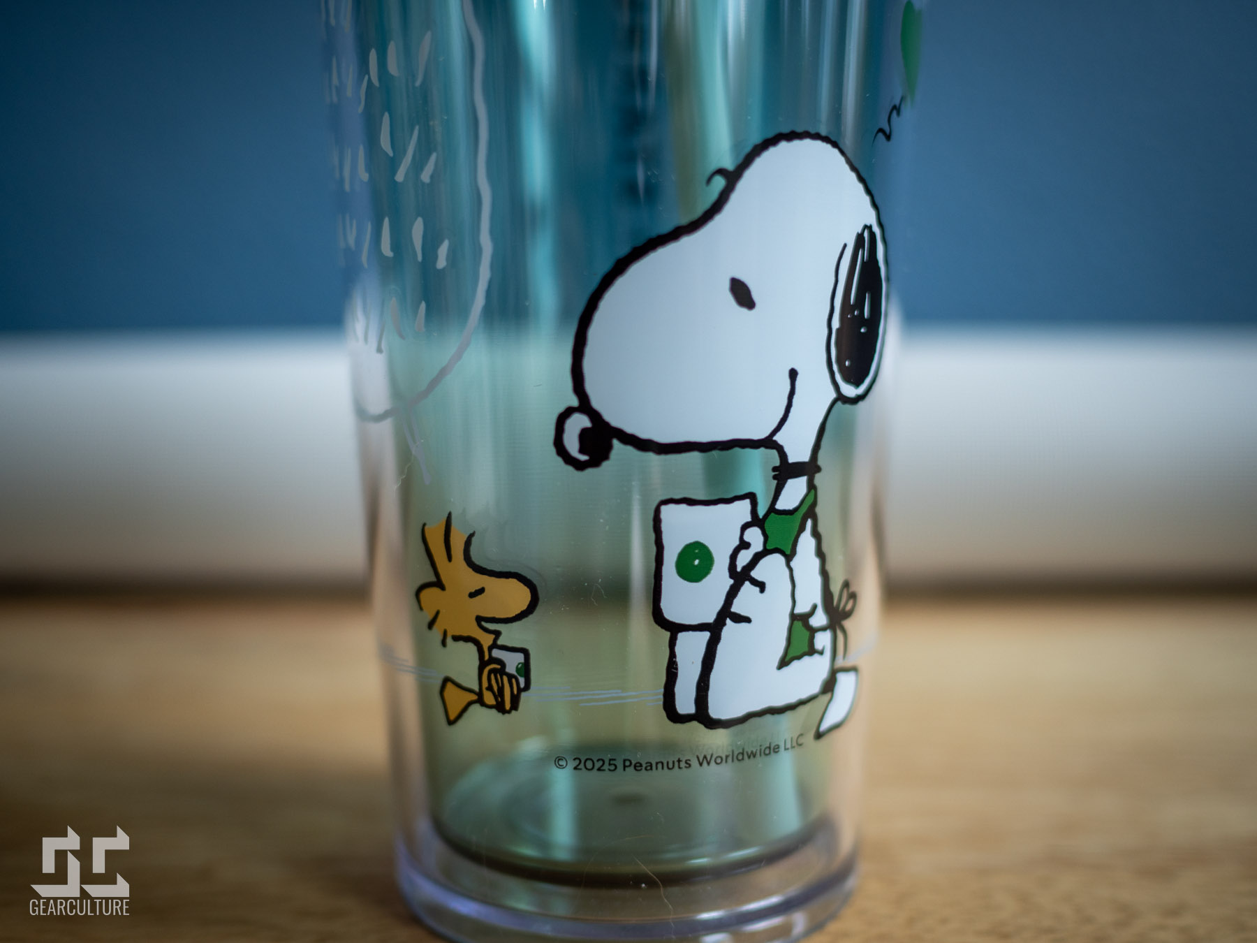
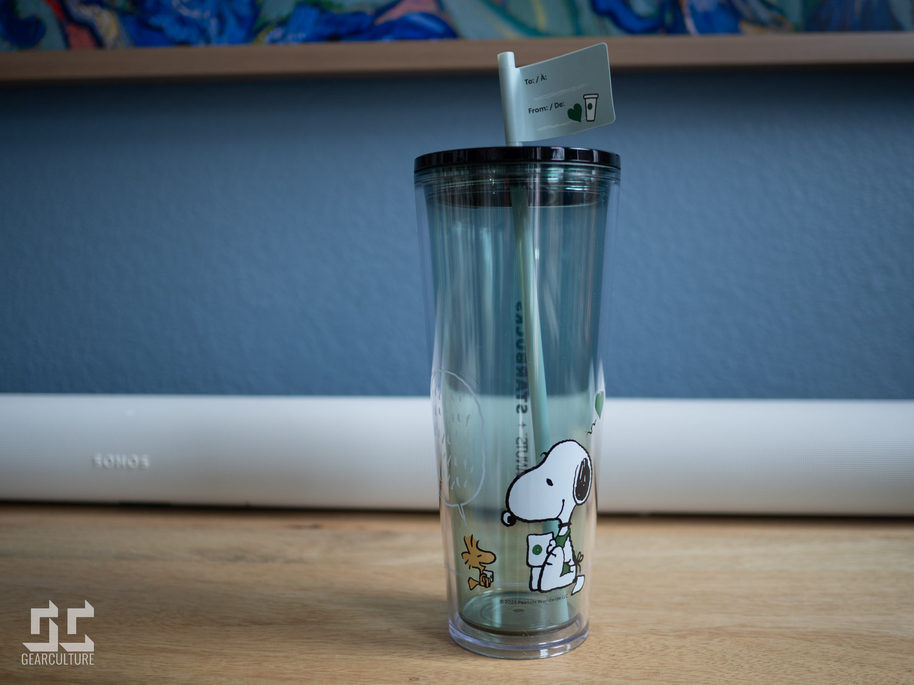
The transparent double-walled cold cup quickly became my new sidekick. Snoopy lounges on one side, looking joyfully content while holding his Starbucks drink as Woodstock mirrors him with an adorably tiny cup. There’s this sweet green heart floating above them that somehow manages to be cute without being childish. The illustration gives the characters room to breathe, like how a good race engineer gives clear, concise instructions instead of overwhelming the radio with chatter. Flip it around and you’ll find “PEANUTS + STARBUCKS” in sleek black lettering running vertically along the side. No excessive branding—just clean design that lets me enjoy my cold brew without distraction.


Function-wise? This cup is a champion. Yesterday I filled it with iced coffee before a long writing session, and two hours later my drink was still cold with zero condensation on my notebook. The straw deserves its own mention—substantial enough that it doesn’t collapse when I’m trying to suck up those last precious caffeine drops. It performs with the kind of reliability that would make any precision-focused team proud.
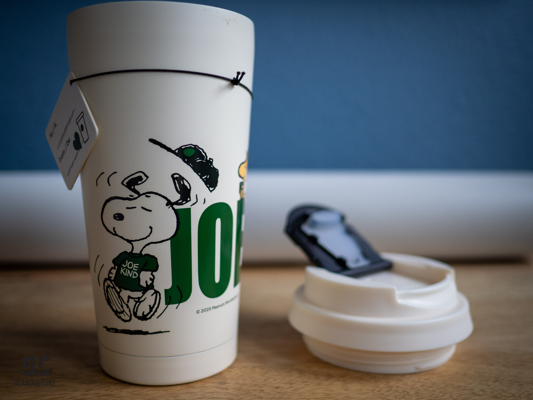
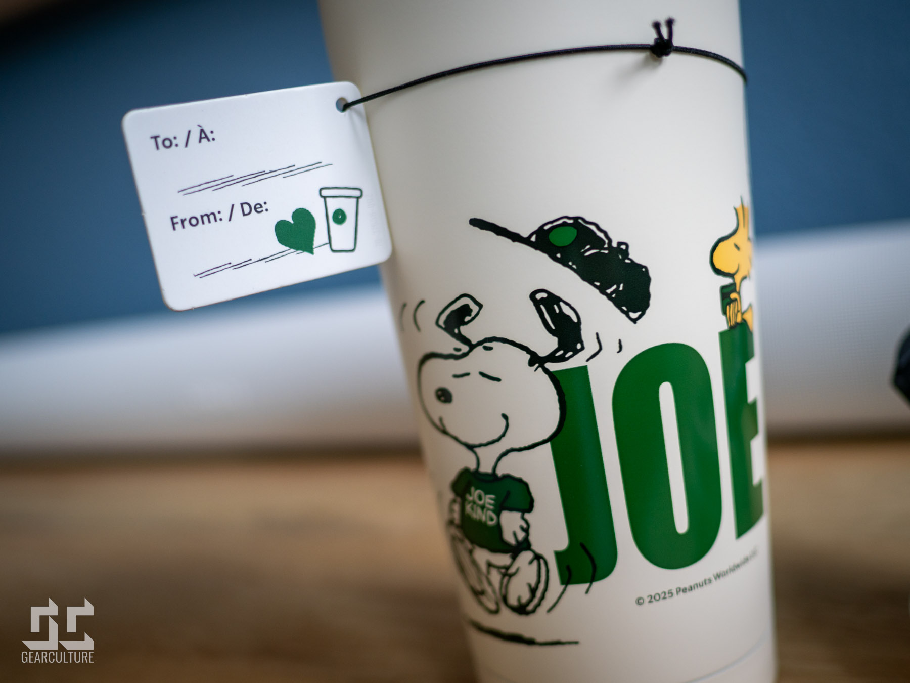
Now about that thermal mug—honestly, where has this been all my caffeine-dependent life? The matte ivory finish feels premium in a way that belies its collab status. No fingerprints, no constant wiping—a blessing for someone who gestures wildly while talking (sorry to everyone who’s ever sat across from me in a café). Snoopy struts his stuff on the side, rocking a “JOE KIND” tee with his cap flying off in what I can only describe as peak coffee euphoria. His expression perfectly captures that moment when caffeine hits your bloodstream during an early morning deadline—pure elation that rivals Lando’s face on the podium after his first win!
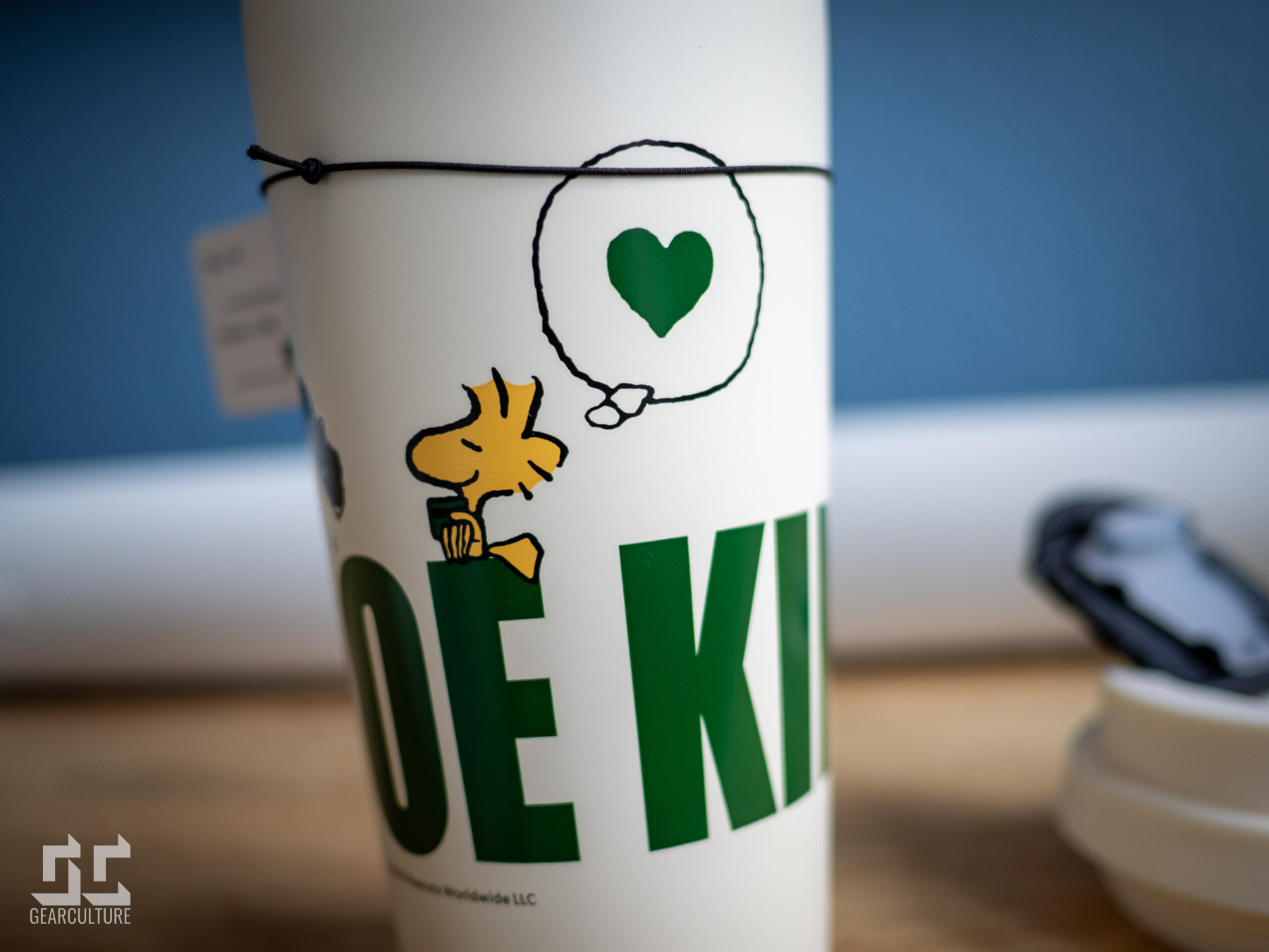
The “JOE” typography in bold green is clever without trying too hard—a subtle nod to “cup of joe” that made me smile with appreciation. It’s thoughtfully designed, like a perfectly calculated strategy call in changing weather conditions. Turn it around and there’s Woodstock perched on the letters, sipping his miniature drink while dreaming of a heart. This thoughtful connection between both pieces creates a cohesive collection that feels intentional rather than randomly assembled.


Performance matters as much as looks, and this mug delivers. My morning pour-over stayed warm through three hours of work yesterday—showing the kind of endurance that would impress even the most demanding engineering team. The flip-top closes with a satisfying click, and the silicone gasket prevents leaks with impressive reliability. The threading hits a good balance—secure enough to prevent spills but not so tight that opening it becomes a struggle requiring mechanics with torque wrenches.
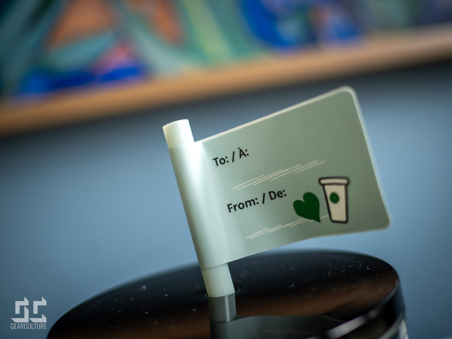
Both pieces include a nice touch—a small flag-shaped gift tag attached with a slim black elastic loop. Printed with “To:” and “From:” lines in English and French, it adds a personal element without feeling excessive. Unlike those bulky merchandise tags that immediately get tossed, this one fits naturally with the design. I’ve kept mine attached since it adds character without getting in the way—subtle and purposeful, like the perfect racing line through a challenging corner.
The collection shows smart design choices throughout. The Peanuts artwork avoids feeling childish or overwhelming. There’s a good balance between the two brands—Starbucks lets Schulz’s characters take center stage without competing elements, unnecessary phrases, or color overload. It’s the collaborative equivalent of a well-executed team strategy where everyone knows their role and executes perfectly.
For daily coffee drinkers, these pieces strike a perfect balance between personality and practicality. They bring a bit of joy to your routine without drawing too much attention or feeling too precious to use regularly. The cold cup survived being knocked against my desk yesterday—proving as resilient as McLaren’s fighting spirit—while the thermal mug has become my morning companion for early deadlines. The collection delivers quality drinkware with just enough character to make your daily coffee ritual feel a little more special.
Good collaborations understand restraint. By keeping things clean, functional, and thoughtfully designed, the Starbucks x Peanuts collection created something that works in real life—not just for Instagram. It knows exactly when to make bold moves and when to let quality speak for itself. And that’s a winning formula I can get behind, one perfectly-timed sip at a time!